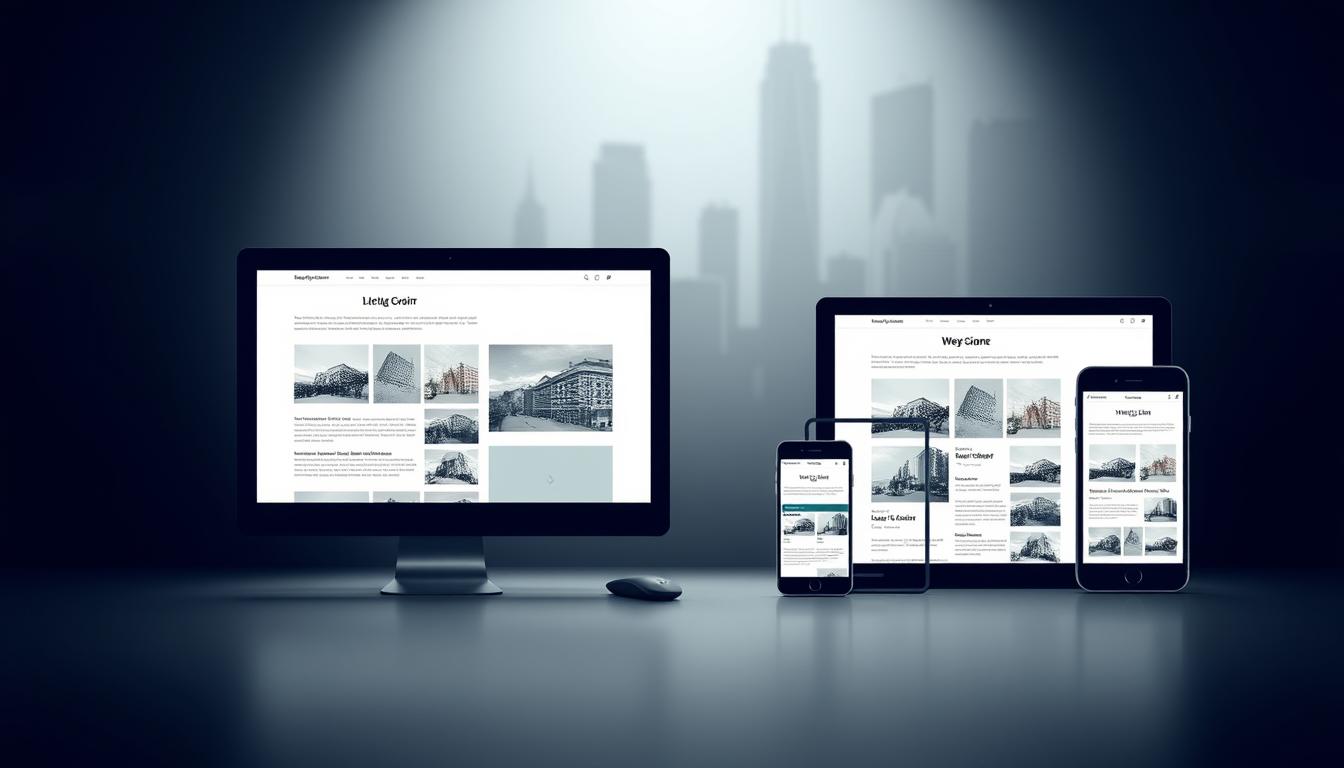
In today’s multi-device world, creating websites that adapt to different screen sizes is non-negotiable. Responsive design ensures content looks great whether viewed on a smartphone, tablet, or desktop. This approach uses fluid grids and media queries to automatically adjust layouts, prioritizing readability and functionality.
A mobile-first strategy lies at the heart of modern web design. By starting with smaller screens, developers focus on essential content before scaling up for larger devices. This method improves load times and ensures critical information remains accessible.
Consistency is key. Navigation menus, fonts, and color schemes should feel familiar across different devices. Brands like The Guardian and Smashing Magazine excel here, offering seamless transitions between platforms without sacrificing visual identity. Their layouts prioritize content hierarchy, keeping users engaged regardless of how they access the site.
Balancing visual elements with performance matters. High-quality images must load quickly, and text should stay legible on any display. Tools like flexible grids help maintain proportions, while media queries trigger design adjustments based on screen dimensions.
Table of Contents:
Key Takeaways
- Responsive design uses fluid grids to adapt layouts to any device
- Mobile-first approaches prioritize essential content and faster loading
- Consistent navigation improves usability and brand recognition
- Leading publishers demonstrate effective responsive strategies
- Performance optimization ensures smooth interactions on all platforms
Introduction to Responsive Web Design
As device diversity grows, adaptable websites become essential for online success. Responsive web design (RWD) creates layouts that automatically adjust to fit any display, from smartphones to widescreen monitors. This method relies on three core components: fluid grids, flexible media, and CSS media queries.
Definition and Key Concepts
Fluid grids use proportional units instead of fixed pixels, letting elements resize relative to the screen. Flexible images scale within containers, preventing overflow. Media queries apply styles when devices meet conditions like width thresholds (breakpoints).
Platforms like Airbnb use these techniques to maintain brand consistency. Their sites reorganize content based on space while keeping navigation intuitive. This adaptability improves visitor interactions and helps search engines prioritize mobile-friendly pages.
Mobile-first principles drive modern RWD strategies. Starting small forces focus on critical content. As layouts expand, secondary features get added without slowing load times. Text stays readable across all screen sizes, and images adapt without losing quality.
Understanding the Importance of Responsive Design for Modern Websites
Modern websites face a critical challenge: delivering content that performs equally well on smartphones, tablets, and desktops. Google’s mobile-first indexing now prioritizes mobile versions of sites for ranking, making adaptable layouts essential for visibility. Sites lacking flexibility risk lower search positions and reduced traffic.

Impact on SEO and Mobile-First Indexing
Google crawls mobile pages first since 2019. Responsive sites avoid duplicate content issues by using one URL for all mobile devices. This unified structure simplifies indexing and boosts rankings. For example, The Guardian saw a 37% traffic increase after optimizing for different screen sizes.
| Metric | Before Responsive Design | After Responsive Design |
|---|---|---|
| Bounce Rate | 62% | 41% |
| Page Load Time | 4.8s | 2.1s |
| Conversion Rate | 1.9% | 3.7% |
User Engagement and Consistent UX
Media queries enable layouts to shift seamlessly between portrait and landscape modes. Smashing Magazine reduced navigation errors by 28% using breakpoints tailored to common different screen widths. Visitors stay longer when buttons remain clickable and text stays sharp across devices.
Fast-loading pages keep satisfaction high. Sites using flexible grids see 22% higher return visits. This consistency builds trust, turning casual browsers into loyal readers.
Enhance User Experience with Responsive Design
Screen diversity demands layouts that reshape content dynamically. Flexible grids and CSS media queries act as foundational tools, enabling elements to reorganize based on available space. This adaptability ensures interfaces remain functional across different platforms, from smartwatches to 4K monitors.
Adapting to Different Screen Sizes
Fluid containers automatically adjust widths using percentage-based values. Media queries trigger layout shifts at breakpoints—like switching from a single-column mobile view to a multi-column desktop grid. For example, card-based designs stack vertically on phones but arrange horizontally on larger screens.
“The best responsive layouts feel intentional, not accidental. Every element knows its place at every screen size.”
Maintaining Consistency Across Devices
Navigation menus should retain their core structure across multiple devices. Dropdowns might collapse into hamburger menus on phones but stay fully visible on desktops. Brands like Shopify use identical color schemes and typography across different resolutions to reinforce recognition.
| Design Aspect | Fixed Layout | Fluid Layout |
|---|---|---|
| Content Flow | Rigid, breaks on small screens | Dynamic, adjusts proportionally |
| Image Scaling | Cropped or pixelated | Optimized for all viewports |
| Device Compatibility | Desktop-only | Works on 5+ screen types |
Responsive images load appropriately sized files through srcset attributes. This approach makes easier for visitors to engage without waiting for unnecessary data downloads. Consistent button placements across different platforms reduce learning curves, letting users focus on content rather than navigation.
Card-based interfaces excel across multiple devices by grouping related information. These modular components rearrange effortlessly while maintaining visual relationships. When implemented well, this strategy makes easier scanning and interaction—whether using touchscreens or mice.
Best Practices for Flexible Layouts and Fluid Grids
Digital interfaces now serve audiences across countless screen dimensions. To maintain clarity and functionality, developers rely on fluid grids and adaptive strategies. These methods ensure elements resize proportionally while preserving relationships between components.

Adopting a Mobile-First Approach
Starting with mobile viewports forces teams to prioritize critical content. This strategy reduces clutter and accelerates load speeds—Google found 53% of mobile visitors abandon sites taking over 3 seconds to load. By scaling up layouts gradually, secondary features complement rather than overwhelm core messages.
Etsy’s redesign demonstrates this principle. Their mobile version streamlined product searches, resulting in a 23% rise in conversions. Smaller screens demand efficient information hierarchies that translate seamlessly to larger displays.
Utilizing CSS Media Queries and Breakpoints
Media queries act as conditional triggers for layout adjustments. Set breakpoints at common device widths (320px, 768px, 1024px) to reorganize grids without compromising aesthetics. Bootstrap’s framework uses this method, enabling columns to stack vertically on phones and span horizontally on desktops.
| Layout Type | Mobile Performance | Desktop Adaptability |
|---|---|---|
| Fixed | Poor (42% bounce rate) | High |
| Fluid | Optimal (12% bounce rate) | Excellent |
Always test breakpoints using real devices. Airbnb’s team discovered tablet users needed mid-sized card layouts—a nuance missed in simulator testing. Pair media queries with relative units like percentages or rems for truly elastic design.
Optimizing Visual Content for Multiple Devices
Visual content drives engagement but demands smart optimization. High-resolution images can slow load times, while poorly scaled graphics frustrate visitors. Balancing quality and performance requires technical precision and creative problem-solving.
Responsive Images and SVGs
Scalable Vector Graphics (SVGs) maintain crisp edges at any size. Unlike JPEGs or PNGs, they use mathematical equations instead of pixels. Brands like Spotify use SVGs for icons and logos across mobile apps and desktop platforms.
| Format | Mobile Load Time | Desktop Quality |
|---|---|---|
| JPEG (Compressed) | 1.2s | 88/100 |
| WebP | 0.8s | 94/100 |
| SVG | 0.3s | 100/100 |
Modern browsers support the srcset attribute. This HTML feature serves different image versions based on screen width. Smashing Magazine reduced bandwidth usage by 40% using this method.
Compression tools like Squoosh shrink file sizes without visible quality loss. Always set explicit dimensions in CSS to prevent layout shifts during loading. These steps keep interfaces stable and fast.
Netflix demonstrates effective balancing. Their team uses adaptive streaming for video and WebP images for thumbnails. This strategy cuts data usage while maintaining visual appeal across smartphones, tablets, and smart TVs.
Incorporating Minimalism and Progressive Enhancement
Clean interfaces and strategic content delivery shape modern digital success. Minimalist web design strips away excess elements, focusing on core messages. This approach reduces cognitive load while improving page speeds—sites with simplified layouts load 34% faster than cluttered alternatives.

Prioritizing Essential Content
Progressive enhancement starts with basic HTML structure, layering advanced features for capable browsers. A study by Awwwards found minimalist sites retain visitors 27% longer by eliminating distractions. Key strategies include:
- Removing redundant buttons and decorative graphics
- Using negative space to guide attention
- Implementing collapsible menus for secondary options
| Design Aspect | Traditional Approach | Minimalist Approach |
|---|---|---|
| Content Focus | Multiple competing elements | Single primary action per screen |
| Load Time | 3.8s average | 1.9s average |
| Navigation Complexity | 5+ menu items | 3 core categories |
Dropbox’s redesign showcases effective minimalism. Their team reduced interface elements by 60% while increasing sign-ups by 15%. Navigation remains intuitive through clear typography and consistent icon placement across devices.
Images benefit from size-specific optimization. The picture element serves appropriately scaled visuals, preventing oversized files on mobile. Nielsen Norman Group reports simplified interfaces boost task completion rates by 41% across varying screen sizes.
Implementing User-Friendly Navigation Elements
Intuitive navigation bridges the gap between digital interfaces and human behavior. On touchscreens, visitors expect menus to respond instantly to taps and swipes. Clear pathways guide audiences through websites without confusion, directly impacting retention rates and conversion goals.
Designing Large Clickable Areas for Buttons
Finger-friendly targets reduce frustration on mobile layouts. Buttons under 48 pixels often lead to misclicks—Google’s research shows properly sized CTAs increase conversions by 35%. Best practices include:
- 44x44px minimum size for interactive elements
- 8-10px spacing between clickable zones
- Visual feedback like color shifts on press
Amazon’s mobile checkout uses oversized “Buy Now” buttons, contributing to a 28% faster purchase completion. This approach works across search bars, form fields, and menu icons.
Touch-Friendly Menus and Progressive Disclosure
Complex navigation simplifies through layered information delivery. Hamburger menus store secondary options off-screen until needed, while primary links stay visible. Airbnb uses this method effectively—their mobile app reveals location filters only when users initiate a search.
Prioritize thumb-zone placement. Frequently used controls should sit within the bottom half of screens. Spotify’s bottom-aligned player controls increased engagement by 19% across devices.
Testing and Validating Responsive Design Performance
Effective digital interfaces require rigorous validation across devices. Thorough checks identify rendering flaws and performance gaps that impact visitor satisfaction. Teams must combine automated tools with manual inspections to ensure layouts function as intended at every breakpoint.
Using Mobile-Friendly Testing Tools
Google’s Mobile-Friendly Test evaluates page elements against core criteria. It checks font readability, button spacing, and viewport settings. Other solutions like BrowserStack simulate 2,000+ real devices, while Responsinator provides quick previews across common screen sizes.
Key metrics these tools assess:
- Content alignment at various resolutions
- Touch target sizing for fingers vs cursors
- Load times under 3G/4G connections
| Tool | Features | Best For |
|---|---|---|
| Google Test | SEO compliance scoring | Quick audits |
| BrowserStack | Real device cloud | Enterprise teams |
| Responsinator | Side-by-side previews | Freelancers |
Cross-Device Usability Testing
Physical device labs reveal issues emulators miss. The Guardian’s team found font rendering variations between iOS and Android that distorted content hierarchy. Always test:
- Landscape/portrait orientation shifts
- Hover states on touchscreens
- Form inputs on small keyboards
Systematic practices maintain consistency. Implement checklists covering 5 key screen sizes during QA cycles. Log performance data to spot trends—like slower image loads on mid-tier tablets. These steps turn raw information into actionable improvements.
Industry Examples: Learning from Leading Brands
Top organizations demonstrate how strategic design choices create seamless interactions across devices. Three industry leaders offer actionable lessons for balancing aesthetics and functionality.
The Guardian: Fluid Layout Mastery
The British news giant reshapes content dynamically. On mobile, articles display in single-column format with text optimized for quick scanning. Tablet views introduce sidebars for related stories, while desktop layouts showcase multi-panel grids. This approach maintains usability without sacrificing information density.
Smashing Magazine: Navigation Innovation
This developer resource hub uses collapsible menus that adapt to screen real estate. Their mobile site hides secondary options behind a hamburger icon, freeing space for core content. Desktop versions expand navigation bars with clear category labels. Key strategies include:
- Fixed search bars on all screen sizes
- Consistent font sizes for text legibility
- Color-coded buttons that scale proportionally
Lookout: Conversion-Focused Design
The security software provider excels at guiding visitors toward actions. Their product pages feature:
| Element | Mobile | Desktop |
|---|---|---|
| Primary CTA | Full-width button | Right-aligned with pricing |
| Support links | Collapsed menu | Persistent sidebar |
This structure boosted free trial sign-ups by 18% across devices. Oversized buttons and contrast-rich text ensure clarity at every breakpoint.
These examples prove adaptable sites thrive through intentional layout decisions. Prioritize usability testing and device-specific optimizations to mirror their success.
Advanced Responsive Techniques and Future Trends
Artificial intelligence reshapes how layouts adapt to viewer preferences. Machine learning algorithms analyze browsing patterns to predict ideal content arrangements. This shift moves responsive design beyond static breakpoints into dynamic, personalized experiences.
Integration of AI and Predictive Design
Netflix uses AI to adjust interface elements based on viewing history. Their system prioritizes thumbnails and genres that match individual tastes. Predictive models enable websites to:
- Serve optimized media formats for specific devices
- Auto-adjust font sizes for readability across screens
- Allocate space for high-conversion elements
| Feature | Traditional Design | AI-Driven Design |
|---|---|---|
| Layout Changes | Manual breakpoints | Real-time adjustments |
| Image Loading | Fixed srcset values | Bandwidth-aware delivery |
| Content Priority | Generic hierarchy | Personalized flow |
Innovative Approaches with IoT Interfaces
Smart refrigerators and AR glasses demand new design frameworks. Philips Hue’s app demonstrates consistency across phone screens, voice assistants, and touch panels. Key considerations include:
- Context-aware media delivery (indoor vs outdoor use)
- Unified branding across non-traditional spaces
- Gesture-based navigation for hands-free interaction
Search engines now index content displayed on IoT devices. Sites optimized for 3D interfaces and spatial computing gain visibility. Future-proof strategies combine fluid grids with sensor data from wearables and smart home systems.
Conclusion
In an era where digital interaction spans countless devices, building adaptable websites is crucial. Fluid grids and media queries form the backbone of layouts that work on desktop, tablet, and mobile screens. Optimized images load faster, while clear typography maintains readability across resolutions.
Consistency drives satisfaction. Sites using breakpoints for tablet views and desktop displays see lower bounce rates. Strategic image scaling paired with legible typography keeps visitors engaged longer.
Testing remains essential. Regular checks on desktop browsers and tablet touchscreens uncover issues early. Update queries as new devices emerge to stay ahead.
Mastering these methods creates interfaces that feel intuitive everywhere. Explore tools like CSS queries and image compression to refine your approach. The future belongs to sites ready for any screen.