
In today’s digital world, having a strong online presence is key for brands to thrive. A company’s website is often the first point of contact with customers. It sets the tone for their experience and impression of the brand.
A well-designed website can greatly improve user experience. This is important for a company’s success online. With more people using mobile devices, having a responsive website is essential for staying ahead in the market.
Table of Contents:
Key Takeaways
- A strong online presence is vital for brands to succeed.
- A well-designed website enhances user experience.
- Responsive web design is key for businesses to stay competitive.
- A company’s website shapes customer engagement and first impressions.
- A digital presence that resonates with the target audience is essential.
The Evolution of Web Design in a Multi-Device World
The rise of digital devices has changed web design. Now, designers make sites that work well on many devices. This includes desktops, smartphones, and tablets.
From Static to Adaptive: A Brief History
At first, websites were fixed and only worked on desktops. But as more devices got internet access, static designs didn’t cut it. So, designers started making sites that could change to fit different screens.
First, designers made many versions of a site for different devices. But with so many devices out there, this wasn’t practical. It was time for a new approach.
The Mobile Revolution and Its Impact
Smartphones and tablets changed how we use the internet. People started using mobile devices more than desktops. This made designers focus on making sites work well on phones and tablets.
This shift led to responsive design. Now, sites adjust to fit any device. This makes sites easier to use on all kinds of devices.
What Is Responsive Web Design?
Responsive web design makes websites change their layout and content for different screens and devices. This way, users get the best experience, no matter if they’re on a computer, tablet, or phone.
Core Principles and Fundamentals
Responsive web design is built on a few key ideas. It uses fluid grids that adjust with the screen size. It also has flexible images that resize as needed. And it employs CSS media queries to change styles based on screen width.
These elements work together. They help websites change their layout, content, and looks for different devices. This ensures a smooth and friendly user experience.
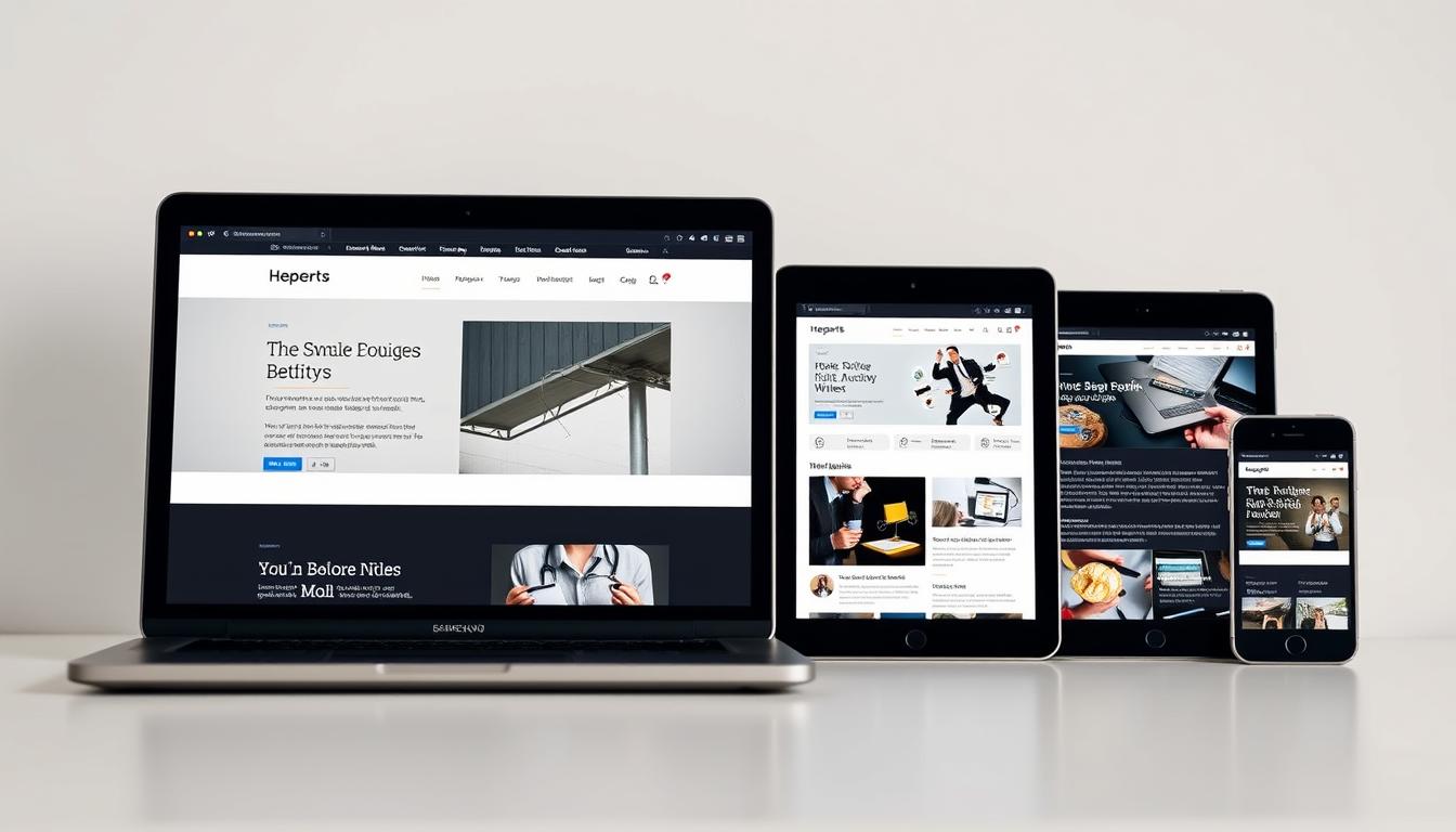
How Responsive Sites Adapt to Different Devices
Responsive websites adjust to different devices with flexible layouts, images, and media queries. For instance, a desktop might show a multi-column layout. But a mobile device might switch to a single-column layout for better reading.
Here’s how different elements change:
| Device | Screen Size | Layout Adjustment |
|---|---|---|
| Desktop | Large | Multi-column layout |
| Tablet | Medium | Adjusted multi-column layout |
| Mobile | Small | Single-column layout |
This adaptation makes sure the website looks good and works well on all devices.
Why Responsive Web Design Matters for Your Business
In today’s digital world, having a responsive web design is essential for businesses to succeed. More and more people use different devices to access websites. A responsive design makes sure your site looks great on any screen size.
Enhanced User Experience Across Devices
A responsive web design gives users a smooth experience, no matter the device. This is key for building trust and keeping visitors engaged. Your website will work well on all devices, making it easy to find and use your content.

SEO Benefits and Google’s Mobile-First Indexing
Responsive web design also boosts your SEO, thanks to Google’s mobile-first indexing. This means Google looks at your mobile site first when ranking. A responsive site is better for mobile, which can improve your search rankings and attract more visitors.
Cost-Effectiveness vs. Multiple Website Versions
Having one responsive website is cheaper than making separate sites for each device. This makes updates easier, saving you money. It’s a smart choice for your business budget.
| Benefits | Responsive Web Design | Multiple Website Versions |
|---|---|---|
| User Experience | Consistent across devices | Varies across different sites |
| SEO Benefits | Improved with mobile-first indexing | Potential duplication issues |
| Cost-Effectiveness | Simplified maintenance and updates | Higher maintenance costs |
Key Components of Responsive Web Design
To improve your online presence, understanding responsive web design is key. It ensures your website looks great on all devices. This is thanks to several important components working together.
Fluid Grids and Flexible Layouts
Fluid grids and flexible layouts are essential for responsive design. They make your site work well on various screens and devices. Percentage-based sizing is a big part of this, letting elements adjust to their surroundings.
Percentage-Based Sizing
Using percentages instead of fixed pixels makes your layout more flexible. This way, your site’s elements can change size as needed, improving the user’s experience.
CSS Grid and Flexbox Implementation
CSS Grid and Flexbox are great for creating complex, responsive designs. CSS Grid handles two-dimensional layouts, while Flexbox is better for one-dimensional ones. Together, they offer the flexibility and control needed for today’s web design.
Responsive Images and Media
Responsive images and media are vital for a fast-loading, great-looking website on all devices. Using the picture element and srcset attributes helps serve the right images based on screen size and resolution.
Picture Element and Srcset Attributes
The picture element and srcset attributes let you control which images are shown based on screen width. This optimizes image loading and speeds up page loading times.
Video and Interactive Media Considerations
When it comes to video and interactive media, consider playback controls, aspect ratios, and loading times. Making sure these elements are responsive and work well on different devices is key for a smooth user experience.
CSS Media Queries
CSS media queries are essential for responsive web design. They let you apply different styles based on screen width or device type.
Breakpoints and Device Targeting
Setting the right breakpoints is important for media queries. By targeting specific device widths or orientations, you can customize your website’s layout and look for different scenarios, making it more user-friendly.
Feature Queries for Progressive Enhancement
Feature queries, or @supports rules, let you apply styles based on CSS feature support. This supports progressive enhancement, ensuring your website works well and looks good on various browsers and devices.
The Mobile-First Approach
Mobile internet use is growing fast. This has made the mobile-first approach key in web design. It focuses on small screens first, then scales up for bigger ones. This new way of designing websites puts the user’s experience on small screens first.
Progressive Enhancement vs. Graceful Degradation
In mobile-first design, two main strategies are used: Progressive Enhancement and Graceful Degradation. Progressive Enhancement starts with a basic experience for all, then adds more for advanced devices. Graceful Degradation starts with a full experience for top browsers, then reduces it for others.
A mobile-first design usually follows Progressive Enhancement. This makes sure the main content and functions work on all devices.
Implementing Mobile-First Design Strategies
Creating a mobile-first design needs careful planning. Two key steps are focusing on small screens and scaling up for bigger ones.
Content Prioritization for Small Screens
Designing for small screens means focusing on what’s most important. Simplify navigation and highlight key actions. Make sure the most important content is easy to find.
Scaling Up for Larger Devices
After designing for small screens, the design is expanded for larger devices. This allows for more complex layouts and features. It also lets you add more detailed content.
| Design Strategy | Key Features | Benefits |
|---|---|---|
| Progressive Enhancement | Basic functionality for all, enhanced for advanced browsers | Ensures accessibility, improves user experience |
| Graceful Degradation | Full-featured for capable browsers, scaled back for less capable ones | Provides rich experience for capable devices, but may leave behind less capable ones |
| Mobile-First Design | Design for small screens first, scale up | Prioritizes essential content and features, enhances user experience across devices |
Essential Responsive Design Frameworks and Tools
In the world of responsive web design, some frameworks and tools really stand out. They help developers make websites that work well on all devices and screen sizes. This makes the user experience better.

Bootstrap: Features and Implementation
Bootstrap is a top choice for responsive design. It has a lot of CSS and HTML classes, plus JavaScript components. This makes it easy to build responsive websites.
To use Bootstrap, you just need to add its CSS and JavaScript files to your project. Then, you can use Bootstrap’s classes to style your website. For example, you can use its grid system to make layouts that change with the screen size.
Foundation and Other Popular Frameworks
Foundation is another big name in responsive design. It has a lot of tools for making responsive websites, like a flexible grid system and UI components. It’s known for being flexible and easy to customize.
Other popular frameworks include Bulma, UI Kit, and Semantic UI. Each has its own strengths and is good for different projects. When picking a framework, think about how easy it is to learn, how customizable it is, and how much support it has.
Design and Development Tools for Responsiveness
There are also design and development tools that help with responsiveness. These tools can be divided into prototyping tools, code editors, and browser developer tools.
Prototyping Tools with Responsive Features
Tools like Figma, Sketch, and Adobe XD support responsive design. They let designers make responsive prototypes and test them on different devices. For example, Figma lets designers create designs that change with the device and orientation.
Code Editors and Browser Developer Tools
Code editors like Visual Studio Code and Sublime Text have extensions that help with responsive web development. They offer features like code completion and live preview. This makes coding easier.
Browser developer tools, found in browsers like Google Chrome and Mozilla Firefox, are key for testing and debugging responsive websites. They let developers check how elements look on different screen sizes and analyze performance right in the browser.
Responsive Typography and Content Strategies
With so many devices out there, using responsive typography is key. It keeps text easy to read and looks good on all screens. Whether you’re on a phone, tablet, or computer, good typography makes content fun and easy to get.
Fluid Typography Techniques
Fluid typography means text changes size smoothly on different screens. Two main ways to do this are with viewport units and the calc() function.
Viewport Units and Calc() Function
Viewport units (vw, vh, vmin, vmax) make text size relative to the screen. The calc() function lets developers mix units for even more flexibility. For instance, using calc() can make text size grow with the screen size, helping it stay readable.
Minimum and Maximum Font Sizes
It’s important to set minimum and maximum font sizes. This keeps text clear on all screens. By setting these limits, designers avoid text that’s too small or too big, making reading easier.
Content Prioritization for Different Screen Sizes
Good content prioritization is key in responsive design. It makes sure important info is easy to find on all devices. On small screens, focus on the main points. On bigger screens, you can add more details.
As Luke Wroblewski, a top mobile design expert, said,
‘Designing for mobile first forces you to prioritize, and that’s a good thing.’
This focus makes the user experience better and more straightforward.
To get this right, designers do content audits. They figure out what content is most important and adjust the layout for each screen size.
Navigation Patterns for Responsive Websites
Good navigation is key for a responsive website. It lets users find what they need on any device. A well-designed system makes sure the site works well on all screens.
Hamburger Menus and Other Mobile Navigation Solutions
Hamburger menus are popular for mobile screens. They save space by hiding menu options. Other options like tab bars and accordion menus also work well, depending on the site’s needs.
Mobile navigation must be easy to use and look good. It should also not get in the way of the main content. Designers need to think about how it works on touch devices, making sure it’s easy to tap.
Designing Intuitive Navigation Across Devices
Creating good navigation means understanding how users behave on different devices. A responsive site’s navigation should change smoothly with screen size. This makes sure users can find what they need easily.
Off-Canvas Navigation Patterns
Off-canvas navigation hides the menu off-screen. It’s revealed with a toggle button, like a hamburger icon. This is great for keeping small screens clean and is often used in responsive designs.
Sticky Headers and Footer Navigation
Sticky headers keep the menu at the top as you scroll. Footer navigation puts links at the bottom, useful for extra info or legal stuff. Both help users find important parts of the site easily.
| Navigation Pattern | Description | Best Use Case |
|---|---|---|
| Hamburger Menu | Compact menu hidden behind an icon | Mobile devices with limited screen space |
| Off-Canvas Navigation | Menu hidden off-screen, revealed on toggle | Responsive sites needing to reduce clutter |
| Sticky Headers | Navigation remains visible on scroll | Sites where quick access to main sections is critical |
“Good navigation makes a website feel like a well-organized library, where everything is easy to find.”
Using these navigation patterns helps designers make websites that work well on all devices. This ensures a great user experience everywhere.
Performance Optimization in Responsive Web Design
In the world of responsive web design, performance optimization is key for a smooth user experience. With people using various devices to access websites, fast loading speeds and efficient performance are critical.
Loading Speed Considerations for Mobile Users
Mobile users want websites to load fast, usually in under 3 seconds. Web developers must focus on loading speed optimization to meet this demand. They can do this by optimizing images, using browser caching, and reducing HTTP requests. This makes mobile browsing better for everyone.
Image Optimization Techniques
Image optimization is vital for better performance. It means making images smaller without losing quality.
Compression and Format Selection
Choosing the right image format and compressing them can greatly reduce file size. Formats like WebP are better at compressing than JPEG and PNG.
Lazy Loading Implementation
Lazy loading helps optimize image loading. It loads images only when they’re visible, cutting down on initial load times.

Minimizing HTTP Requests and Resource Loading
Reducing HTTP requests is important for faster page loads. This can be done by combining files, using CSS sprites, and caching in browsers. Also, optimizing resource loading with code splitting and asynchronous loading boosts performance.
By using these strategies, web developers can make responsive websites that work well on all devices. These sites load fast and provide a smooth user experience.
Testing Your Responsive Website
The digital world is getting more diverse, making responsive website testing more important. It’s key to make sure your site works well on all devices and browsers. This ensures a great user experience.
Cross-Browser and Cross-Device Testing Methods
For compatibility, you need to test your site on different browsers and devices. Check how it looks on Chrome, Firefox, and Safari. Also, test it on desktops, tablets, and smartphones.
Physical Device Testing vs. Emulators
Testing on real devices gives the most accurate results. But, using emulators on your computer is cheaper and more flexible. Both ways have benefits, and using them together is best.
Automated Testing Solutions
Automated testing tools make testing easier. Tools like Selenium and Cypress run tests on various browsers and devices. They’re great for checking if updates work without messing up the site.
Tools and Resources for Responsive Testing
Many tools help with responsive testing. Chrome DevTools and other browser tools let you test on different devices. Sites like BrowserStack and Responsively App offer wide testing options.
Using these tools and methods, you can make sure your site works well everywhere. It will give users a consistent and great experience.
Common Responsive Design Challenges and Solutions
Making a website responsive comes with its own set of problems. These include dealing with complex data and high-resolution images. Designers and developers face many challenges when trying to make websites work well on different devices. They need to find creative ways to solve these issues.
Tables and Complex Data Presentation
One big problem in responsive design is showing complex data, like tables, in a way that’s easy to use on small screens. Designers can use collapsible columns or scrollable tables to help with this. This makes the data easier to access.
- Use CSS media queries to hide or show columns based on screen size.
- Implement JavaScript solutions to make tables responsive.
High-Resolution Images and Retina Displays
High-quality images are important for a good-looking website. But, they can slow down websites, even more so on mobile devices. To fix this, designers can use:
- Image compression techniques to make images smaller without losing quality.
- Responsive image formats like WebP that support high-resolution images.
Third-Party Elements and Embedded Content
Adding third-party elements, like social media widgets and maps, can be tricky in responsive design. It’s important to make sure these elements work well on different devices.
Social Media Widgets and Maps
To include social media widgets or maps, use responsive embed codes from the service. For example, Twitter and Facebook have options for responsive embeds.
Advertising and Analytics Scripts
For ads and analytics scripts, make sure they load without blocking the main page. This helps the website run smoother.
By tackling these common responsive design challenges, developers can make websites that are better for users. These websites will work well on many devices.
Future Trends in Responsive Web Design
The world of responsive web design is changing fast. New tech like AI, container queries, and adaptive components is leading the way. Designers and developers must keep up to make websites that look great and work well on all devices.
Adaptive Components and Container Queries
Adaptive components are key in responsive web design. They change how they look and work based on where they are used. This makes the user experience better. Container queries let designers style elements based on their container size, not just the screen size. This adds flexibility to complex layouts.
Using adaptive components and container queries helps designers make more advanced and responsive sites. This is very useful for complex web apps. There, different parts need to fit well on various screens and orientations.
AI and Automated Responsive Design
Artificial Intelligence (AI) is now a big part of responsive web design. It helps make design solutions that can change on their own. AI looks at how users act and what they like to make websites better in real-time.
Machine Learning for User Experience Optimization
Machine learning looks at lots of user data to find patterns and likes. This lets it make websites better for each user. It can change the layout, where things are placed, and even the colors to match what each user prefers.
Voice and Gesture Interfaces
Voice and gesture interfaces are changing how we use websites. Now, responsive design must think about how users will interact, whether by voice or gestures. This means considering more than just screen sizes.
| Trend | Description | Impact |
|---|---|---|
| Adaptive Components | Components adjust layout and functionality based on context | More tailored user experience |
| Container Queries | Style elements based on container size, not viewport | Greater flexibility in complex layouts |
| AI in Responsive Design | AI analyzes user behavior to optimize layout and content | Real-time optimization for better user experience |
Conclusion: Embracing Responsive Design for Long-Term Success
Responsive design is key for businesses to thrive online. A responsive website works well on all devices, giving users a great experience. This is true for different screen sizes and orientations.
Using responsive design helps businesses stand out online. It makes websites more user-friendly and boosts sales. With most people using mobile devices, having a responsive site is essential for success.
A responsive website also helps with search engine rankings. Google favors mobile-friendly sites. By choosing responsive design, businesses can stay ahead in the digital world.