In today’s world, WordPress responsive design is key. Over half of all web traffic comes from mobiles. So, making your website mobile-friendly is crucial for keeping users engaged and boosting your SEO.
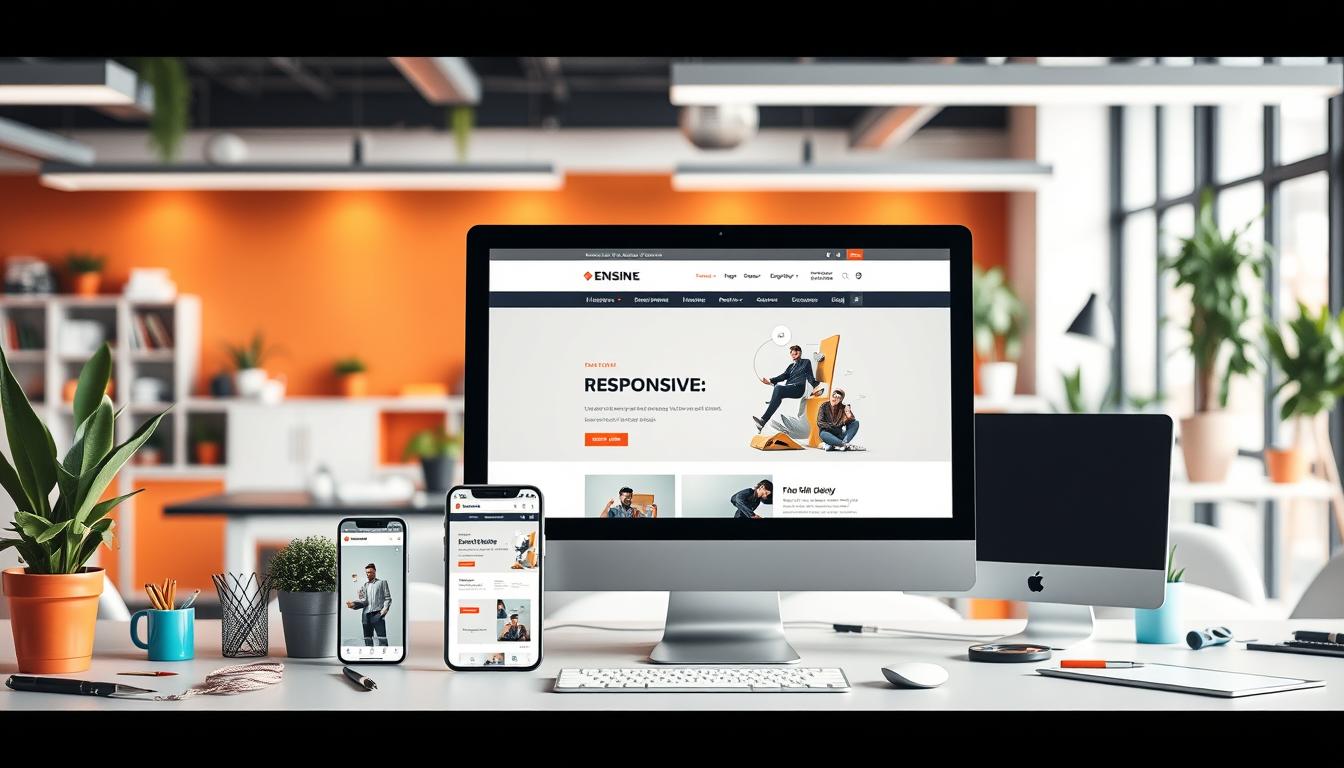
Responsive design lets WordPress sites adjust to any screen size. This means your site looks great on desktops, tablets, and phones. Google also favors mobile-friendly sites in search results, making responsive themes a must-have for businesses and individuals.
Using SEO-friendly WordPress design makes your site easier to use and maintain. You only need one website that works on all devices. Themes like Astra, GeneratePress, and Kadence offer solutions that meet user needs well.
Tools like Kubio help even those without tech skills create stunning mobile sites easily. By focusing on mobile content and using fluid grids and flexible images, you can make your site engaging and efficient on any device.
Table of Contents:
Key Takeaways
- Responsive design is crucial for reaching mobile audiences, who represent 55% of web traffic.
- Google prioritizes mobile-friendly websites for better SEO rankings.
- The Kubio Theme enables hassle-free responsive designs tailored for mobile users.
- Choosing responsive WordPress themes allows for versatile layouts across different screens.
- Regular testing on multiple devices ensures optimal responsiveness and user experience.
- Fluid grids and flexible images help maintain design consistency across various devices.
Understanding Responsive Design in WordPress
Responsive design is key in today’s web world, especially with WordPress. It makes sure websites look good on any device, giving users a great experience. With more people using mobiles, knowing about responsive design is crucial.
What is Responsive Design?
Responsive design lets websites change how they look based on the device. It uses fluid grids, flexible images, and media queries. This way, a WordPress site looks great on any screen. It’s all about making sure users have a good experience, no matter what device they use.
Importance of Responsive Websites
Responsive sites are more important than ever. Over 55% of web traffic comes from mobiles. Google also favors mobile-friendly sites, which helps with SEO and keeps users engaged. Having a responsive site can really help businesses stand out online.
How Responsive Design Works
Responsive design uses several technical parts to work well. Fluid grids and flexible images adjust to different screens. Media queries let designers change styles for different devices. Testing on various devices makes sure the site works well, making it easy for users to use.
Benefits of WordPress for Responsive Design
WordPress is great for making websites that work well on all devices. It has millions of users worldwide. This means it’s very good at fitting different screens.
Designers can make sites that look good and work well on phones and tablets. WordPress themes, plugins, and a big community help a lot. This makes building websites easy and fun.
Flexibility with Themes
WordPress has many themes to choose from. This makes it easy to make websites for different devices. The best themes have special features for phones, tablets, and computers.
This lets developers make sites that match their brand and what their audience likes. It’s all about making websites that work well for everyone.
Extensive Plugin Ecosystem
There are lots of plugins for WordPress. These plugins can make websites more interactive and fun. You can add things like image sliders, contact forms, or online shops.
Plugins are key to making websites responsive. They help make websites better for users.
Strong Community Support
The WordPress community is very helpful. It has forums, tutorials, and shared experiences. This means developers can always get help and solve problems together.
This support makes using WordPress themes and plugins easier. It helps developers overcome any challenges they face.
Key Principles of Responsive Design
Responsive design is built on key principles. These ensure websites work well on all devices and screen sizes. It makes websites easy to use and looks good on any device.
Fluid Grids
Fluid grids are crucial for responsive design. They use percentages instead of fixed sizes. This lets elements change size as needed, keeping content looking good on any device.
- Maintain proper proportions of elements under various screen sizes
- Enhance usability through consistent layout adjustments
- Reduce the need for extensive media queries when designing layouts
Flexible Images
Flexible images are key for a good website. They can grow or shrink to fit their space, looking sharp on any screen. Here’s how to manage images well:
- Using CSS properties to adjust image size based on screen dimensions
- Implementing source-sets to deliver different image resolutions for various devices
- Loading images efficiently with lazy-loading techniques to improve performance
Media Queries
Media queries are the heart of responsive design. They let developers change styles based on device features. This is key for a good user experience. Here’s how to use media queries:
- Define breakpoints that correspond to design needs rather than relying solely on device types
- Enhance performance through precise targeting of styles for different conditions
- Support the mobile-first approach by prioritizing mobile layouts in the initial phase of design
Choosing a Responsive WordPress Theme
Finding the right responsive WordPress theme is key for a smooth user experience on all devices. With over half of the world’s internet traffic coming from mobiles, picking a theme that adapts well and loads fast is crucial. Here’s a guide on what to look for in a responsive WordPress theme, along with some top picks and customization tips.
Factors to Consider
- Responsiveness: Make sure the theme looks great on all screen sizes. This keeps visitors engaged and lowers bounce rates.
- Customization: Find themes that let you change colors, layouts, and features easily, without needing to code a lot.
- Speed: Themes that load quickly make for a better user experience and can help your site rank higher in search results.
- Support: Pick themes from developers who provide good support and keep their themes updated to stay safe from security threats.
- Compatibility: Make sure the theme works well with important plugins like WPtouch and Elementor for the best functionality.
Top Responsive WordPress Themes
Here are some top WordPress responsive themes:
| Theme | Key Features |
|---|---|
| Astra | Fast loading, highly customizable, compatible with multiple page builders. |
| Divi | Visual builder, large selection of pre-made layouts, responsive settings. |
| OceanWP | Great for e-commerce, extensive demos, easy to customize. |
| Flatsome | Best for online shops, optimized for speed, user-friendly. |
| Shopkeeper | Responsive design, excellent support for e-commerce features. |
Customizing Your Chosen Theme
Customizing your theme can really make your site stand out. Start by changing your site’s colors and fonts to match your brand. Use srcset and lazy loading for images to speed up your site without losing quality. Always test your theme on different devices and browsers to ensure a consistent experience for all visitors. By focusing on these areas, your site will do well in today’s mobile world.
Responsive Design Best Practices
Creating a mobile-friendly website is key. Focus on content, speed, and easy navigation. These steps improve user experience and SEO.
Prioritize Content
Organizing content well is crucial. Use short paragraphs and bullet points for quick reading. Adding white space makes text easier to read.
Optimize Load Speed
Fast load times are important. Use small image sizes and JPEGs to save space. Fewer HTTP requests also help. A quick site keeps users coming back.
Mobile-Friendly Navigation
Simple menus make browsing easier. Test your site on different devices to ensure it works well. A good site encourages users to explore more.

| Best Practice | Description | Benefits |
|---|---|---|
| Content Prioritization | Organize content hierarchically, focusing on key messages. | Improved readability and user engagement. |
| Load Speed Optimization | Compress images and minimizeing HTTP requests. | Faster loading times, better SEO performance. |
| Mobile Navigation | Create simplified and intuitive menu structures. | Enhanced user satisfaction and lower bounce rates. |
Tools for Testing Responsive Design
In the world of responsive web development, having the right tools is key. They help make sure your website works well on all devices. These tools analyze how your site looks on different screens and sizes. Here are some top tools for testing:
Browser Developer Tools
Most browsers have developer tools for quick testing. By pressing F12 or right-clicking and choosing “Inspect,” you can see how your site looks on different screens. This quick feedback is great for making changes as you go.
Online Responsiveness Testers
- Testsigma: Offers over 1000+ browser-OS combos and 2000+ iOS and Android devices for automated testing.
- Responsinator: A free tool for a quick check, but it has ads.
- Screenfly: Lets you add custom screen sizes and supports many devices.
- Am I Responsive?: Shows sizes for four Apple devices for direct comparison.
Real Device Testing
- CrossBrowserTesting: Tests on over 2050 real desktop and mobile browsers with visual comparisons and remote debugging.
- BrowserStack: Tests across 2000+ real browsers and devices, with automated testing and security.
- LTBrowser: By LambdaTest, it offers 27+ devices, network throttling, and more.
Testing well ensures your website works great on mobile. With mobile traffic at 65%, these tools are more important than ever. They help make sure your site works well on all devices, giving users a smooth experience.
Leveraging Page Builders for Responsive Design
Today, having a website that looks good on all devices is key. Page builders make it easy to create beautiful, flexible websites without needing to know how to code. They help ensure your site looks great on phones, tablets, and computers.
Overview of Popular Page Builders
WordPress has many page builder plugins, like Elementor, Beaver Builder, and WPBakery. These tools let users build custom layouts easily. They come with lots of widgets and modules for customization. This makes it simple to make quick design changes.
Advantages of Using Page Builders
Page builders make designing websites much easier. They offer many benefits:
- Drag-and-drop tools make creating layouts simple.
- They save time, helping you finish projects faster.
- You don’t need to know how to code, making them easy to use.
- They work with add-ons and extensions to improve your site.
- They also help with SEO, making your site easier to find online.
Creating Responsive Layouts
Creating responsive layouts is easy with these builders. They offer templates made for mobile devices. This ensures your site looks good on all screens.
For example, Elementor starts at $49 a year, while Beaver Builder is $99 a year. BoldGrid’s Post and Page Builder offers over 200 templates for $2.50 a month. This means there’s a builder for every budget.
Page builders also have A/B testing for better landing pages. They work with CRM software to help get more leads. This makes them a great choice for anyone focusing on responsive design.
| Page Builder | Starting Price | Key Features |
|---|---|---|
| Elementor | $49/year | Over 150 templates, drag-and-drop functionality |
| Beaver Builder | $99/year | Includes five modules, pre-built elements |
| BoldGrid | $2.50/month | 200+ industry-specific templates |
Optimizing Images for Different Devices
Optimizing images is key to a better website performance, especially with responsive design. Mobile devices are a big part of web traffic. Good image quality and speed are crucial for a great user experience. This ensures images look great and load fast on any device, boosting site performance.
Importance of Image Optimization
Image optimization is vital for website speed and user engagement. Studies show that 70% of customers consider website speed when shopping. By optimizing images, you can cut webpage size by 50%-60%, making it load faster on all devices. Since images can be 30%-85% of a website’s size, focusing on them is essential.
Tools for Image Compression
Many tools help with image compression, keeping quality high while reducing file sizes. Tools like Optimole, Bunny, and Cloudflare Images are great for WordPress. They improve loading times, especially for mobile users. Using a wordpress responsive plugin can also enhance image performance on various devices.
Techniques for Responsive Images
Responsive images are crucial for a smooth user experience. The `srcset` attribute lets developers use different image sizes for different screens. Formats like WebP are up to 34% smaller than JPEGs and work well in modern browsers. Lazy loading images can also improve mobile performance by loading them only when visible.
| Image Format | Average Size Reduction | Best For |
|---|---|---|
| JPEG | Up to 90% | Photographs and complex images |
| PNG | 70% with lossless compression | Images requiring transparency |
| WebP | 25-34% smaller than JPEG | All-purpose use for high quality |
| GIF | Moderate | Simple animations |
Implementing Media Queries in WordPress
Media queries are key in making websites work well on all devices. They help adjust how a site looks based on the device it’s viewed on. This ensures a great experience for everyone, no matter the screen size.
Basics of Media Queries
Media queries check the environment where a site is viewed. They use things like max-width and min-width to change how things look. This is based on how wide or narrow the screen is.
Common Use Cases
- Changing how a site looks on phones versus computers, especially for common sizes like 1366×768 for desktops and 360×640 for phones.
- Adjusting text sizes and spacing to make reading easier on smaller screens.
- Showing or hiding certain parts of a site to make it better for different devices.
Best Practices for Responsive CSS
To make media queries work well, follow some key tips. These help make your site look good on any device. Here’s what to do:
- Start with styles for small screens and then add more for bigger ones.
- Don’t have too many media queries. It makes things easier to manage.
- Use WordPress themes and plugins that handle media queries for you.
Using Plugins for Responsive Design
Plugins are key in making WordPress sites responsive. With mobile users now more than desktop users by nearly 20%, having a site that works on mobile is crucial. Many wordpress responsive plugins make mobile optimization easier, letting site owners focus on creating engaging content.
Recommended Responsive Design Plugins
- WPtouch – a popular choice that turns your site into a mobile-friendly version effortlessly.
- AMP for WordPress – optimizes content for faster loading on mobile devices.
- WP Engine Premium Themes – offers mobile-responsive and search-engine-optimized themes.
- Kadence Blocks – provides granular responsive controls for enhanced design options.
- Jetpack – includes features for dynamic image loading and mobile adaptations.
How Plugins Enhance Functionality
Plugins make adding responsive design easier and add more features to your site.
For example, a hamburger menu for mobile navigation saves space and makes it easy to use. Mobile-friendly forms also make interactions better on all devices, improving the user experience. Many wordpress responsive plugins work well with the best wordpress responsive themes, making sites work well on all screens.
Plugin Compatibility Considerations
When using plugins, make sure they work with your theme. Most modern WordPress themes already have responsive design, so your site will work well. It’s important to test your site on different devices, like smartphones, tablets, and smart TVs. This ensures your site looks good and works well on all screens without losing its design.

SEO Considerations for Responsive Design
Responsive web development is key for a website’s success. It’s all about how well a site works on mobile devices. An SEO-friendly WordPress design boosts user experience and search rankings.
Impact on Search Rankings
Google now favors mobile-friendly sites. Responsive designs help sites rank higher because they’re easier to use. Fast-loading pages also help with SEO, as Google values speed.
Mobile-friendly sites offer a better user experience. This leads to more visitors and higher rankings.
Techniques for SEO Optimization
To optimize your site, use proper headings and structured data. This makes it easier for search engines to find your content. Alt tags for images improve accessibility and help search engines understand your site better.
Websites that use these strategies can outperform others in search rankings. They can also reach more people.
Integrating Analytics
Analytics tools help track how well your site performs. They show how users interact with your site on different devices. This information helps improve your site for better user experience.
Responsive design can lead to higher conversion rates. It’s especially important for e-commerce sites.
The Role of Typography in Responsive Design
Typography greatly affects how users feel about a website, especially on mobile. Choosing the right fonts and sizes helps keep content easy to read on all devices. For a wordpress responsive design, designers must focus on how text looks on different screens.
Choosing the Right Fonts
Most websites use two to three fonts. One for body text, another for headings, and sometimes a third for decoration. Fonts like Arial, Verdana, and Open Sans are good for screens because they’re easy to read.
Responsive Font Sizing Techniques
Font sizes between 16 and 18 pixels are usually comfortable for reading. Also, line spacing of 1.5 to 1.6 times the font size helps a lot. Responsive design uses adaptive and liquid layouts to fit screens of all sizes.
Using minimal breakpoints in adaptive layouts makes content flow better. This is great for all kinds of devices.
Tools for Typography Management
Using tools for managing typography is key for keeping designs consistent and readable. Many resources help designers check font performance and make changes. This ensures the typography fits perfectly with the design.
As web design becomes more focused on typography, the right tools are crucial. They help create effective mobile-friendly websites.
Keeping Up with Responsive Design Trends
It’s important for website owners and designers to stay ahead in responsive web development. As technology and user preferences change, keeping up with these trends is key. This section looks at the current state of responsive design in 2023 and what the future might hold.
Current Design Trends in 2023
Responsive design has seen big changes in 2023. Some key trends include:
- Prioritization of Speed: Faster websites are more important than ever. A 1-second delay can lead to a 4.5% drop in conversion rates. Tools like NitroPack can help make websites load faster.
- Simplified User Interfaces: Websites are now cleaner and simpler. They focus on making content easy to find on any device.
- Integration of Lazy Loading: Techniques like BJ Lazy Load and A3 Lazy Load make websites load faster. They only load images when they’re needed, improving the user experience.
Future Predictions for Responsive Design
The future of responsive web design looks exciting:
- AI-Powered Design Tools: Automation and AI will make web design easier. They’ll help create websites that adapt to each user’s needs.
- Expansion of Content Delivery Networks (CDNs): CDNs will become more important for fast website loading. They cache data close to users, reducing latency.
- Greater Emphasis on Accessibility: Responsive design will focus more on making websites accessible to everyone. This includes features for users with disabilities.
Resources for Staying Informed
To keep up with these trends, using various resources can help:
- Design Blogs: Follow design blogs to learn about new trends and best practices.
- Webinars and Online Courses: Attend webinars and take online courses on responsive design.
- Community Forums: Join web development forums to share ideas and solutions with others.
Common Challenges in Responsive Web Design
Responsive web development faces many challenges that affect user experience. Making a smooth wordpress responsive layout needs careful attention to several areas. This includes managing content overflow, solving compatibility problems, and mixing beauty with usefulness.
Overcoming Content Overflow
Content overflow happens when things don’t fit right on smaller screens. Since over 63% of internet traffic comes from mobiles, this is a big issue. To solve it, developers use flexible grids, responsive images, and avoid fixed sizes.
They also use tools like Bootstrap for fluid images. CSS properties like width and max-width help a lot in showing content well.
Addressing Compatibility Issues
Compatibility is a big problem in web design. Older browsers, like Internet Explorer version 8 and below, lack support for key features like media queries. Since 74% of mobile visitors leave if sites aren’t responsive, focusing on newer browsers is key.
Keeping up with browser trends helps make sites work well on different platforms.
Balancing Aesthetics and Functionality
It’s important to balance looks and function in web design. Businesses need to make sure their sites are nice to use without losing their beauty. This means adjusting menus for mobiles and thinking about multimedia’s impact.
Optimizing images and videos is crucial since 53% of mobile visitors leave if sites are slow. Using responsive tables and vertical scrolling makes sites easier to read and use on small screens.
| Challenge | Impact | Solutions |
|---|---|---|
| Content Overflow | Poor visibility on mobile devices | Use fluid grids and responsive images |
| Compatibility Issues | Frustrated users with unsupported browsers | Focus on modern browsers and media queries |
| Balancing Aesthetics | Decreased engagement and higher bounce rates | Optimize load speeds and responsive design elements |
Resources for Learning More About Responsive Design
If you want to get better at responsive web development, there are many resources to help. Online courses and tutorials are great because they teach you in a structured way. Sites like Udemy and Coursera have courses from top experts, helping you learn about making websites that work on all devices.
Online Courses and Tutorials
There are also many tutorials online, covering everything from the basics to advanced topics. These resources can really help you understand and use responsive design. This way, you can make websites that look good on any device.
Recommended Books and Blogs
Reading good books and following blogs is also key to learning. Books like “Responsive Web Design” by Ethan Marcotte and online articles give you the latest on web design. Blogs like CSS-Tricks and Smashing Magazine share the latest trends and tips in responsive web design.
Community Forums and Groups
Joining community forums and groups is also a good idea. Sites like Stack Overflow and Reddit are great for asking questions and getting advice. Being part of a community helps you grow and learn more about responsive web design.